
Titles

- Above I have tried and experimented with different fonts to use for our title of the film opening.
- When trying out different fonts I wanted them to be clean cut, modern and classic.
- However when trying out the different fonts I felt that the font should have twist on the modern look by there being something unusual as the genre of our film opening is a psychological horror.
- When experimenting with the fonts I tried out different spacings between letters and the composition of the title.
- Overall I felt that the one line title was more solid and effective however I did like (middle left) as it provoked this classic and modern look.
- Below are, in my opinion, the most successful title fonts for our film opening 'Young Blood'
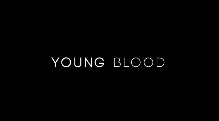
Font: Biko
- What I find interesting about this title is the juxtaposition between the boldness of the two words.
- The font also projects a classic and modern look.
- By the use of the two fonts having two different weights it suggests that there are two sides to our Killer. The bolder one being the one they show and the lighter one, the deeper and sadistic side.
 Font: Baron Neue
- What I like about this font is the abnormalities on the 'O's. They are underlined which could be a reference to the underlying issues that our killer is suffering with.
- When creating this title I only used the special characters on the 'O's as I felt the title was more effective this way.
- I like how there is the strange quirkiness yet still captures that modern look I was aiming for.
Credits

- Keeping in the theme of the previous two font ideas which I liked the most, I experimented with some credits ideas
- In the first font idea, I used the idea of the two different weights in the words. This time I applied it to my name and the opposite way around putting more impact on my last name as it is more effective then the other way around.
- I also made the job title the same weight as my last name because it needs to be made clear what position it is.
- In the second idea, I used the abnormalities in the 'O's again however only in the name. I did this to draw more attention to the name.
- I also used italics for the job title to differentiate it from the name.
Conclusion

- In conclusion I am most pleased with the font 'Baron Neue'.
- I find that it provides the film opening an interesting yet modern feel to it which I had hoped for.
- I am particularly intrigued by the abnormalities of the 'O's as they could represent the faults in the killer them self.
- The font also conveys the modern look I liked yet adds that horror quality to it which is needed as our film opening is a psychological horror.
- To develop this further I will try and manipulate the text either to make it appear more distorted or to animate
No comments:
Post a Comment