Showing posts with label typography. Show all posts

Thursday, 6 February 2014

Finalising Credits


  • Previously I looked into the typography to use in our film opening title and credits. 
  • I have refined it down to using the font 'Biko' which is very clean cut and modern and can be moulded to fit most film genres.
  • The original idea for the credits were:

  • However I didn't test it out on more than one name which lead to issues of the layout and the overall appearance.
  • After taking the factors that went wrong into consideration I redesigned the layout and positioning of the credits.
  • Here is the basic structure in which I created using multiple names. 


  • I am overall really pleased with the outcome of the new design for the typography credits, they have come out more professional and I particularly like the use of spacing and contrasting font weights.
  • However I felt that it would be nice if the credit typography was manipulated to have a slight disfigurement to make a subtle reference to the killer's underlying psychological problems.
  • After experimenting with different effects I used this one:


  • Here I used an effect called 'Scrape' which distorts and elongates words. I have used it to create this slight disfigurement in the template for the credits.
  • I quite like the simple and subtle quirk to the credit and provides that slight disfigurement I had hoped for.

settings I used to create the slight manipulation

  • After this I wanted to add a slight bit of movement to the credits as they were looking rather dull.
  • After a series of trials I thought the most effective effect was 'Projector' with an overlay of 'Shadows'
  • The 'Projector' effect alters the credits to make them shake a little as well as add slight noise to the black background as well as add a slight glow to the text.
  • Then the use of the 'Shadow' effect to slightly dull the white text which was needed after the 'Projector' effect increased the white in the text which was just to much/
  • Overall the outcome of the credits, I feel, have been well executed and are finished enough to the point of them being ready to use straight away for the opening credits of our film opening.
  • The slight shakiness, I feel adds to the effectiveness of our film genre, Psychological Horror.
  • I think that these credits will work really well in the film opening and enhance the quality, making our film opening appear more professional
  • In the clip above shows the order in which the credits appear as well as the length the credits will stay on screen for which is 3 seconds (at the moment).
  • In between these credits will be the edited footage of our film.


Sunday, 12 January 2014

Typography Manipulation.

Typography: Adoble Photoshop CS6.

This week I decided to try and mnipulate different fonts of text to try and make them have different effects on them in adoble photoshop CS6.
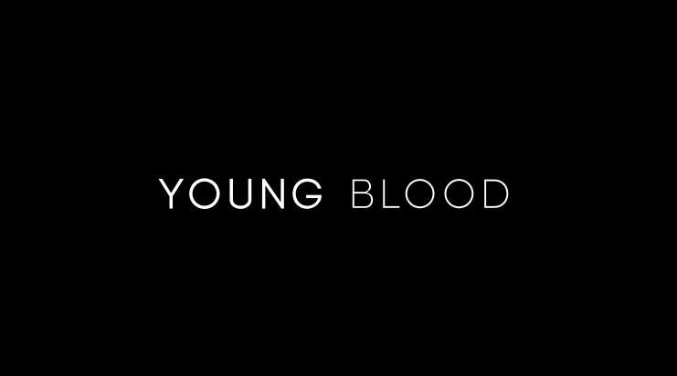


Typography: Title.

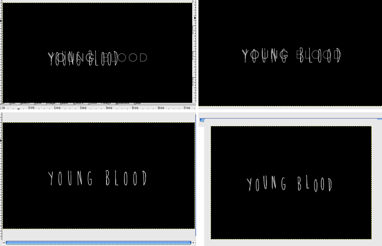
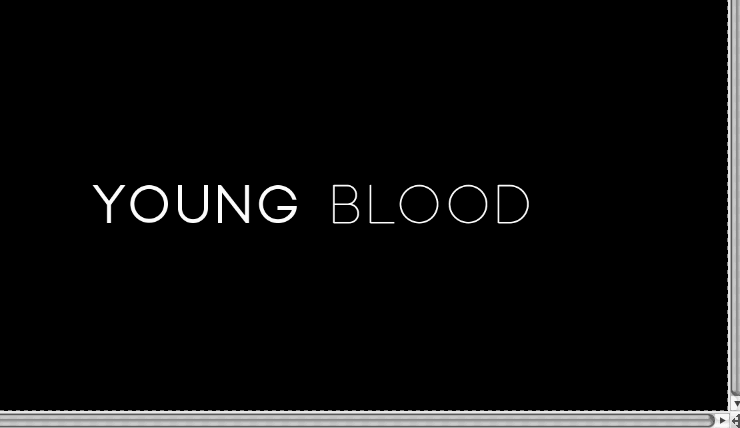
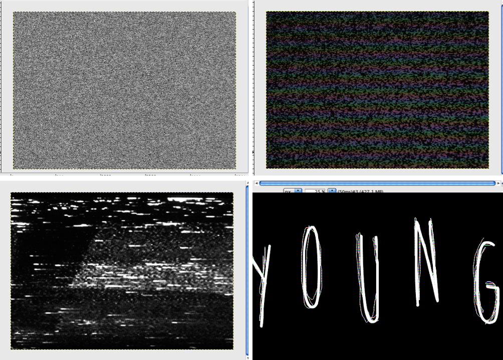
I used photoshop CS6 to play around with what we could do with our title's typography for our film opening. 

For the some of them I used a property of satin and made the boldness of the actual red colour mode bold and more faded to see what it would look like. On one of them I also changed the position of the effect so that it wasnt covering the whole of the text, so some of the original black text was still there.

I also did some basic effects like putting a jagged edge round some of the text and putting borders of a different colour on some and changed the colour of the text to a different one and putting a gradient on it as well.

I also put a back shadow on one to make it look like that text is more 3D but no actually being 3D. I also used an effect where you put another colour onto the text and make it speckled by turing the colour's effect onto disappear and so it doesn't cover the whole of the text but makes it look like it is speckled or splattered with the colour.

Evaluation.
Overall I think the text I have created were good but quite basic so they could be developed more to actually changing the shape of the text itself. This would give the text a more developed and professional look and may also be more parallel with our film opening and it's genre of a psychological horror.

Sunday, 15 December 2013

Film Title Animation


  • At the beginning of the animation, I used the font that Charlie selected: x
  • The other font I used was 'Brain Flower'.
  • I chose this font as it appears to be handwritten.
  • I further manipulated the text on photoshop, by placing each letter on a different level.
  • This added to the handwritten result, inspired by titles in the psychological horror film Orphan.


  • I wanted the animation to flicker between the two fonts and have a broken TV effect.


  • To create this effect, I used uncopyrighted grainy, noise textures.
  • The animation flickers quickly between the two fonts with these textures in between.
  • I also 'scribbled' around the Brain Flower font, to add to the handwritten effect.


  • The frames of the animation that contain the manipulated font and the VCR textures play for a much shorter amount of time than the font that Charlie created; the end result resembles the flashbacks that are included in our opening.
  • Overall, I am happy with the result: the clean font at the beginning reflects upon the beauty that our killer strives for, whilst the manipulated font represents the horror underneath. Furthermore, I feel that the result fits within the psychological horror genre.

Tuesday, 26 November 2013

Film Opening Typography

Font Ideas
Titles


  • Above I have tried and experimented with different fonts to use for our title of the film opening.
  • When trying out different fonts I wanted them to be clean cut, modern and classic.
  • However when trying out the different fonts I felt that the font should have twist on the modern look by there being something unusual as the genre of our film opening is a psychological horror.
  • When experimenting with the fonts I tried out different spacings between letters and the composition of the title.
  • Overall I felt that the one line title was more solid and effective however I did like (middle left) as it provoked this classic and modern look.
  • Below are, in my opinion, the most successful title fonts for our film opening 'Young Blood'


Font: Biko
  • What I find interesting about this title is the juxtaposition between the boldness of the two words.
  • The font also projects a classic and modern look.
  • By the use of the two fonts having two different weights it suggests that there are two sides to our Killer. The bolder one being the one they show and the lighter one, the deeper and sadistic side.

Font: Baron Neue
  • What I like about this font is the abnormalities on the 'O's. They are underlined which could be a reference to the underlying issues that our killer is suffering with.
  • When creating this title I only used the special characters on the 'O's as I felt the title was more effective this way.
  • I like how there is the strange quirkiness yet still captures that modern look I was aiming for.


Credits


  • Keeping in the theme of the previous two font ideas which I liked the most, I experimented with some credits ideas
  • In the first font idea, I used the idea of the two different weights in the words. This time I applied it to my name and the opposite way around putting more impact on my last name as it is more effective then the other way around.
  • I also made the job title the same weight as my last name because it needs to be made clear what position it is.
  • In the second idea, I used the abnormalities in the 'O's again however only in the name. I did this to draw more attention to the name.
  • I also used italics for the job title to differentiate it from the name. 
Conclusion


  • In conclusion I am most pleased with the font 'Baron Neue'.
  • I find that it provides the film opening an interesting yet modern feel to it which I had hoped for.
  • I am particularly intrigued by the abnormalities of the 'O's as they could represent the faults in the killer them self. 
  • The font also conveys the modern look I liked yet adds that horror quality to it which is needed as our film opening is a psychological horror.
  • To develop this further I will try and manipulate the text either to make it appear more distorted or to animate

Sunday, 17 November 2013

Typography Deconstruction


The main typography of this poster is white and so stands out from the rest of the poster because of the stark colour. The font is made up of mixed lower case and upper case letters looks like it was hand written by a child which informs the audience that the film is about a child and so is scary as children starring as antagonists in horror films is a frightening concept. This font juxtaposes with the rest of the text on the poster which is in all capitals and written in a basic, clean font. This contrast again draws more attention to the title and also emphasises that there is something wrong with the main character.


The title is typed in all capitals and is black in colour, standing out against the stark white background and following the monochromatic colour scheme of the poster. The text has been manipulated so there appear to be scratch marks running through the title, reinforcing the horror genre as the scratch marks have connotations of violence and mystery.


The title is orange in colour and contrasts with the dark greys and blues in the background, so it attracts the audience's attention straight away. The text is in all capitals and has been edited to look as if the letters have been trampled on and parts have been rubbed away, informing the audience that physical violence is a central part of the plot and so meets audience expectations of the horror genre.


Manipulating Text with Photoshop

For this practical task I used Photoshop CS6 to manipulate text.

I began by downloading a font called Assassins from the internet and opening it in Photoshop.

I opened the typography tool bar and adjusted the colour of the text from black to a dark burgundy colour to mimic the colour of dried blood so the text would look more sinister. I also adjusted the spacing of the letters so they were spaced slightly further apart than before.


I used a smudge tool to blur the bottom and top of the text to create contrast in the text, and also to make the text look more mysterious to conform to the conventions of pyschological horror.


Then I created a black and white gradient background with the gradient tool and used the dodge tool to adjust the colour of the middle of the text so it was brighter and the colour of fresh blood. I did this to create more contrast and make the title stand out more. 

I then experimented with different text effects to manipulate the text further, such as creating shadows around the letters or making the text look more textured


Evaluation
 
  • I found this task a little difficult as I have little experience with Photoshop and editing software so I was reliant on online tutorials and experimenting with the tools until I found the ones that were the most suitable for this task.
  • To improve next time I will familiarise myself with editing software so I will be more experienced with manipulating text and creating typography.


Sunday, 3 November 2013

Manipulating Text

I practiced manipulating text using an online photo editor called Pixlr. First I opened a new image and chose the font I wanted for the typography.


I then used different tools to manipulate the text and make it look more disturbing as this typography is supposed to be used in a psychological horror film. For example I used a blur tool to create slight shadows around the font and blur the edges slightly so it was more interesting to look at than plain text on a stark background. 


I decided to experiment with more tools to make the font look different but still eye catching, such as using bloat and pinch tools to manipulate the shape of the font extremely. I felt this particular manipulation was effective for typography used for psychological horror because the text looks warped and strange, which conveys the genre accurately.

I also used tools such as the sponge and drop tool to fade the colour of the text. This manipulation made the text look shadowy and sinister while still retaining the original shape of the letters, creating juxtaposition between the harsh font and the softer colour of the text. However I felt this manipulation was not very effective and looked quite amateurish. 


I faced some difficulties during this practical as I do not have much experience with photo editors and found this particular editor difficult to use. It took me a lot of time to work out how to use the tools and what their purposes were and so my manipulations were quite basic. 


Wednesday, 23 October 2013

'Ghost Ship' Deconstruction

The sequence I will be deconstructing for typography and sound is the opening of 'Ghost Ship'.


Typography


The font is bright pink in colour and looks kitsch and retro as font like this was used in many films circa the 60's and 70's. This is synchronous with the film opening as the opening scene is set in 1962. The bright colour and swooping font conveys a sense of fun, which lulls the audience into a false sense of security as 'Ghost Ship' is a horror film and the tense atmosphere is not made apparent in the first couple of minutes of the opening, making the impending horror even more impactful on the audience.

Sound
The sequence begins with off-screen diegetic music compromised of high strings and piano that is synchronous with a panning shot of a cruise ship. In the next scene the diegetic sound of a woman singing a slow love song is onscreen and synchronous with shots of the singer and people dancing to the music on the ship's deck,creating a relaxed and romantic atmosphere. The singing is overlapped with the diegetic sound of people's general chatter in one scene, reinforcing the relaxed social atmosphere and keeping the audience unprepared for the horror soon to come. Later on in the sequence the now off-screen singing is overlapped with eerie non diegetic music and diegetic sounds of levers cranking and whirring and metal wire grating against more metal. These harsh sounds juxtapose the calm singing and interrupt the previously happy atmosphere while the background music creates a sinister undertone to the singing, foreshadowing the impending horror. The background music intensifies, gradually getting louder than the singing and comprising of tense high string instruments and echoing wind instruments, creating tension and dissipating the previous atmosphere as it's made clear to the audience that something terrible is about to happen. The diegetic sound of metal wire unravelling, snapping and slicing through the air, furniture, and eventually the bodies of the people dancing on the deck overlaps the non diegetic music, followed by the wire vibrating with tension which is synchronous to the sinister background music that has now completely drowned out the previous singing. As a result, the mood from the beginning of the sequence has now changed into a tense, frightening one synchronous with the gory action happening onscreen. The non diegetic background music quietens to a high synthesised note that is overlapped by the grating diegetic sound of the wire swinging back and forth, followed by blood splattering on the floor and people's bodies hitting the floor from where the wire has cut them in half. The last notable sound is of a young girl (the only survivor of the incident) screaming shrilly; the sound of the scream is edited so it sounds slightly echoed which has sinister, supernatural connotations and so is appropriate for the film genre.