I have looked at the psychological thriller 'Funny Games' opening titles for inspiration for our film opening. Within this opening they use a bold and modern font which is clean cut. As for the colour they have opted for a vibrant red; possibly to symbolise the violent nature of the film.
This film opening can provide inspiration to our film opening with the use of it's simplistic font and layout over the film.
0.24
Title
'Funny Games'
Text over scene
Straight cut
Duration: 0.05

0.30
Lead Actor
'Naomi Watts'
Text over scene
Straight Cut
Duration: 0.04

0.34
Lead Actor
'Tim Roth'
Text over scene
Straight Cut
Duration: 0.03
0.37
Lead Actor
'Michael Pitt'
Text over scene
Straight Cut
Duration: 0.03

0.40
Lead Actor
'Brady Corbet'
Text over scene
Straight Cut
Duration: 0.03

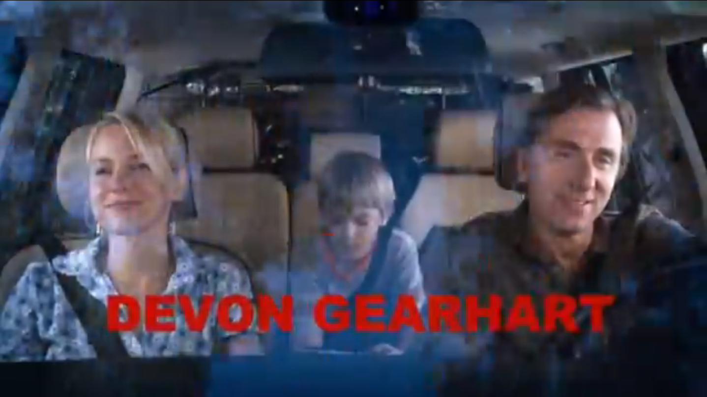
0.42
Lead Actor
'Devon Gearhart'
Text over scene
Straight Cut
Duration: 0.04

0.45
Supporting Actors
'Boyd Gaines'
'Siobhan Fallon Hogan'
Text over scene
Straight Cut
Duration: 0.03

0.48
Supporting Actors
'Robert LuPone'
'Susanne Haneke'
'Linda Moran'
Text over scene
Straight Cut
Duration: 0.04
0.52
Director of Photography
'Darius Khondji AFC ASC'
Text over scene
Straight Cut
Duration: 0.02

0.54
Editor
'Monika Willi AEA'
Text over scene
Straight Cut
Duration: 0.02
0.56
Sound
'Tom Varga'
Text over scene
Straight Cut
Duration: 0.02
0.58
Production Designer
'Kevin Thompson'
Text over scene
Straight Cut
Duration: 0.02
1.00
Costume Designer
'Kevin Thompson'
Text over scene
Straight Cut
Duration: 0.02
1.02
Music
'Georg Friedrich Händel'
'Pietro Mascagni'
'W.A. Mozart'
'John Zorn'
Text over scene
Straight Cut
Duration: 0.02
1.07
Casting
(Casting, New York Casting, UK Casting)
Text over scene
Straight Cut
Duration: 0.07
1.14
Make Up, Hair, Prop Master
Production Sound Recordist,
Sound Editor, Sound Mixer
Text over scene
Straight Cut
Duration: 0.07
1.21
Assistant Director, Script Writer,
Assistant Camera, Gaffer, Key Grip, Dolly Grip
Text over scene
Straight Cut
Duration: 0.07
1.30
Writer and Director
'Michael Haneke'
Text over scene
Straight Cut
Duration: 0.03