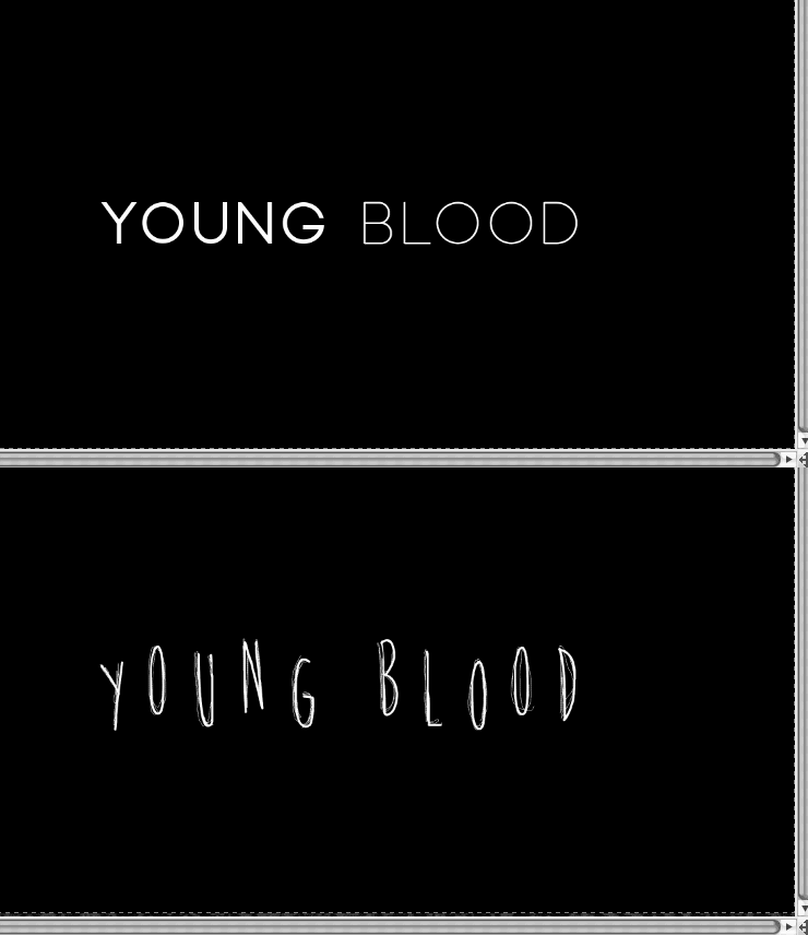
These are the final questions that we sent for the questionnaire and we shared the link to the survey on social media sites such as Tumblr, Facebook and Twitter and are trying to reach 70 responses to get a wide range of opinions of what our film opening should include and look like.
Saturday, 30 November 2013
Questionnaire
For our film opening we have conducted a survey/questionnaire on the website survey monkey. To do this I just linked up out gmail account to the website so that it would be accessible for the whole group to looks at. Within our survey we included questions that would be at least answered by 70 people between the ages of 15 years and 22 years of age about music, costume and general ideas for our film opening.
Friday, 29 November 2013
Survey Results.
Analysis of Survey Results.
For our survey we received 78 responses from people between the ages of 15 and 22 years of age.
Some of the questions we very clear on what our target audience wanted but with some of the results we didn't agree with the audience.
Question One.
For our survey we received 78 responses from people between the ages of 15 and 22 years of age.
Some of the questions we very clear on what our target audience wanted but with some of the results we didn't agree with the audience.
Question One.
For question one we asked what gender should the killer be in our film opening. It was close between female and unknown gender but unknown gender came out with the most responses. This is what we were thinking of doing for our film opening to create suspicion in the audience to who the killer is but we may also consider the killer showing female characteristics to throw the audience off as also our killer is obsessed with beauty and youth they may be more likely to be female than male.
Question Two.
The responses for what our killer should wear came back as we were thinking of clothing that will hide their identity to keep the audience thinking of who the killer may be. So we will go through with this result and keep their clothing unisex and big so you cannot see who it is.
Question Three.
The results of the question we asked regarding sound in our film opening came back with the audience wanting eerie music included in the film opening. We were also considering to put sudden noises and metallic sounds into the music as well as what the audience requested to create a more complicated and effective music track that will relate to the film opening.
Question Four.
Question four asked about where the killer's lair should be located and came to a strong result of a basement. Our group will stick to this result as we know of a location in which we can use.
Question Five.
The results of question five told us that our audience would want the killer to use a normal household object such as a knife or hammer. This is what we will go with in our film opening as we were already considering using these types of objects for our killer's weapon.
Question Five.
This question with how the victims should be treated by the killer was quite close between the killer torturing them first and them being alive when the killer cuts them open. This can be an opportunity for us as a group to incorporate both of the popular results to make the opening more appealing to the audience.
Question Seven.
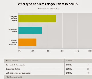
At first the results came through for this question as suggested deaths but in the end the audience wanted gory and obvious deaths. We were going to include both of these as it will give us an opportunity to use our skills and also not have so much information in the film opening that it will make it look more like a trailer.
Question Eight.
The clear winner of this question was that the audience wanted the killer to keep parts of their victims. We will use this information when creating our film opening to include body parts in the killers lair to keep the audience interested.
Question Nine.
This question coincides with what we were going to do at the end of our film opening of a stalking scene to create a cliff hanger for the audience and from these results we can see that this is exactly what the audience wants.
Thursday, 28 November 2013
Location: Killer's Basement
- In our film opening, the audience are invited into the Killer's 'basement'. Within this 'basement' contains the equipment in which they use to torture his victims. As well as this they also display a photo montage where the Killer displays their triumphs of their past victims deceased and tortured for their beauty and blood. Along with the images for the Killer to keep a keen recollection of they also have jars upon jars filled with souvenirs of their past victims such as teeth, blood etc.
- In the film opening we are using this garage for the killer to keep their jars, tools and photo montage. The garage itself is a dingy, dark and unsettling environment which is perfect for our killer to make their den for their dark practise.
Scenes to use
- Here I have captured different areas of the garage which would be the suitable to use for our film opening.
- When taking these shots I tried to avoid the garage door to give the illusion that this is actually a basement.
- When taking these images I took them on the video setting of my camera in order to capture the essence of how they will actually look when filming
- These images provoke the dark an
- When filming for the opening I will use flashing lights and red lighting in some shots to
Ideas on shooting
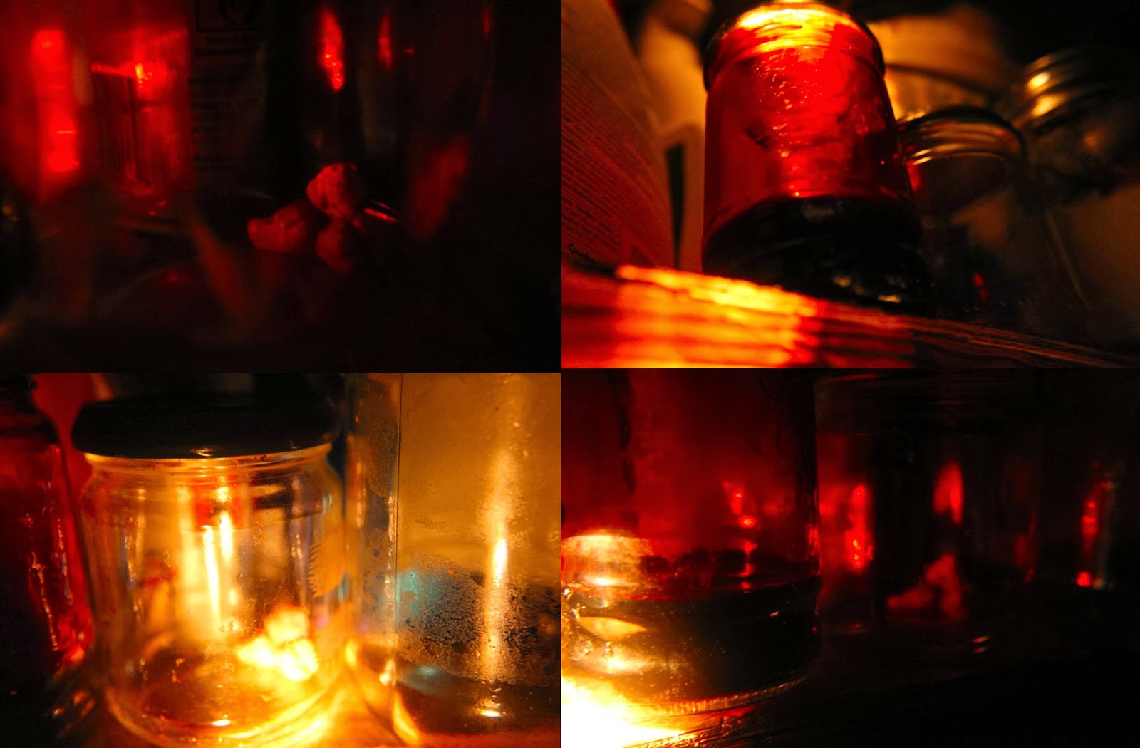
- Here I took a couple of jars that Ellen made to see where to situate the props and how to capture them when filming. I placed them on one of the many shelves in my garage.
- When shooting for the final footage, I will clear out anything that won't tie in with the mysterious persona we have created for our killer.
- Here I did some test shots for the jars which the killer keeps. I used a warm white light for these set of shots for the warmer tones.
- One jar was filled with 'blood' so I aimed the light onto this jar which projected the red tones around the frame. The reason for this is that it denotes the theme of film which focuses on our killer slaughtering youthful women and girls for their blood to bathe/drink in order to remain youthful.
- The red also signifies the cautious and manipulative behaviour of our killer.
- To capture these shots I used a macro lens as it will me to capture the finer details of the shot and get up really close to the subjects (in this case the jars) where as a standard lens won't let me.
- I am particularly interested in the first shot in the second row - I love the glow of the 'teeth' and the glares in the jar as well as the pop of cyan blue in the other jar.
- Overall these jar shots were effective in showing some ideas of how to film these for the film opening.
- Again I have tested out another idea of a shot I could use in the film opening.
- Here I have captured the shadow of my hand holding one of the jars.
- I really like the outcome of this image because it provides an interesting and and creative shot yet it masks our killer's identity.
- Overall this shot would be a great idea to use in the film opening as it provides ambiguity of our killer and is an interesting and creative shot. What I particularly like about this shot is the use of the glass glares contrasting against the gravity.
Ideas for Editing
- For this scene where the killer goes into his garage to prepare for his next victim I feel that quick straight cuts and flashing would be effective
- However when doing this I need to make sure it doesn't come across like a trailer.
- Within the footage of our killer going around observing his past and preparing for his future victim there will be short sharp straight cuts of flashbacks to the scenes of the deceased.
- By using the flashbacks it will give an insight into the gruesome truth behind our character
- The flashback will be quite grainy and lo-fi representing the killer having recollections.
Conclusion
- Overall the garage is an ideal location to use for the film opening as it projects the gritty and dark nature of the killer as well as containing several shots with potential once all the props has been placed in the desired locations.
- By doing the test shots it has enabled me to get the grasps and get together a plan of how I'm going to shot this scene and where to put the props and what additional items I need such as torches for the lighting.
- Also by shooting in video mode has allowed me to see how the footage will appear and where I need to improve on like the angles of the lighting and the positioning of how far the light needs to be from the camera.
Wednesday, 27 November 2013
Analysis of Survey Results.
For our survey we received 78 responses from people between the ages of 15 and 22 years of age.
Some of the questions we very clear on what our target audience wanted but with some of the results we didn't agree with the audience.
Question One.
For our survey we received 78 responses from people between the ages of 15 and 22 years of age.
Some of the questions we very clear on what our target audience wanted but with some of the results we didn't agree with the audience.
Question One.
For question one we asked what gender should the killer be in our film opening. It was close between female and unknown gender but unknown gender came out with the most responses. This is what we were thinking of doing for our film opening to create suspicion in the audience to who the killer is but we may also consider the killer showing female characteristics to throw the audience off as also our killer is obsessed with beauty and youth they may be more likely to be female than male.
Question Two.
The responses for what our killer should wear came back as we were thinking of clothing that will hide their identity to keep the audience thinking of who the killer may be. So we will go through with this result and keep their clothing unisex and big so you cannot see who it is.
Question Three.
The results of the question we asked regarding sound in our film opening came back with the audience wanting eerie music included in the film opening. We were also considering to put sudden noises and metallic sounds into the music as well as what the audience requested to create a more complicated and effective music track that will relate to the film opening.
Question Four.
Question four asked about where the killer's lair should be located and came to a strong result of a basement. Our group will stick to this result as we know of a location in which we can use.
Question Five.
The results of question five told us that our audience would want the killer to use a normal household object such as a knife or hammer. This is what we will go with in our film opening as we were already considering using these types of objects for our killer's weapon.
Question Five.
This question with how the victims should be treated by the killer was quite close between the killer torturing them first and them being alive when the killer cuts them open. This can be an opportunity for us as a group to incorporate both of the popular results to make the opening more appealing to the audience.
Question Seven.
At first the results came through for this question as suggested deaths but in the end the audience wanted gory and obvious deaths. We were going to include both of these as it will give us an opportunity to use our skills and also not have so much information in the film opening that it will make it look more like a trailer.
Question Eight.
The clear winner of this question was that the audience wanted the killer to keep parts of their victims. We will use this information when creating our film opening to include body parts in the killers lair to keep the audience interested.
Question Nine.
This question coincides with what we were going to do at the end of our film opening of a stalking scene to create a cliff hanger for the audience and from these results we can see that this is exactly what the audience wants.
Tuesday, 26 November 2013
Film Opening Typography
Font Ideas
Titles
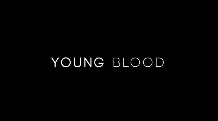
Font: Biko
Credits
Titles
- Above I have tried and experimented with different fonts to use for our title of the film opening.
- When trying out different fonts I wanted them to be clean cut, modern and classic.
- However when trying out the different fonts I felt that the font should have twist on the modern look by there being something unusual as the genre of our film opening is a psychological horror.
- When experimenting with the fonts I tried out different spacings between letters and the composition of the title.
- Overall I felt that the one line title was more solid and effective however I did like (middle left) as it provoked this classic and modern look.
- Below are, in my opinion, the most successful title fonts for our film opening 'Young Blood'

Font: Biko
- What I find interesting about this title is the juxtaposition between the boldness of the two words.
- The font also projects a classic and modern look.
- By the use of the two fonts having two different weights it suggests that there are two sides to our Killer. The bolder one being the one they show and the lighter one, the deeper and sadistic side.
- What I like about this font is the abnormalities on the 'O's. They are underlined which could be a reference to the underlying issues that our killer is suffering with.
- When creating this title I only used the special characters on the 'O's as I felt the title was more effective this way.
- I like how there is the strange quirkiness yet still captures that modern look I was aiming for.
Credits
- Keeping in the theme of the previous two font ideas which I liked the most, I experimented with some credits ideas
- In the first font idea, I used the idea of the two different weights in the words. This time I applied it to my name and the opposite way around putting more impact on my last name as it is more effective then the other way around.
- I also made the job title the same weight as my last name because it needs to be made clear what position it is.
- In the second idea, I used the abnormalities in the 'O's again however only in the name. I did this to draw more attention to the name.
- I also used italics for the job title to differentiate it from the name.
Conclusion
- In conclusion I am most pleased with the font 'Baron Neue'.
- I find that it provides the film opening an interesting yet modern feel to it which I had hoped for.
- I am particularly intrigued by the abnormalities of the 'O's as they could represent the faults in the killer them self.
- The font also conveys the modern look I liked yet adds that horror quality to it which is needed as our film opening is a psychological horror.
- To develop this further I will try and manipulate the text either to make it appear more distorted or to animate
Monday, 25 November 2013
Filming Flashbacks
Filming: Noose Flashbacks.
Final Clip.
I used the noose I had previously made and and put some fake blood on it to start off. I held the noose up and flickered a torch on and off and filmed two different lighting and angles at first.
Then I put fake blood on my had and took a close up shot of it holding the noose whilst flicking the torch on and off as well.
I also did another close up shot of where I put some more fake blood onto the bottom of the noose and waited for it to drip off. When editing this I had to speed it up as it took a while to fall and also looked more effective.
Final Clip.
Overall I thought that the filming for this part of the flaskbacks was really good, but because I filmed it portrait I will need to refilm it another time. I also think I could include more shots and different angles of it to make it more effective including more close up shots to make the blood on the noose look thicker.
Sunday, 24 November 2013
Camera Movements
Pan
Tilt
Tracking
Dolly Zoom
Handheld
Crane
Zoom
- A panning shot is where the camera pivots horizontally.
- This can be either right to left or left to right
- Gives viewer a panoramic view
Tilt
- A tilt shot is where the camera pivots vertically
- This can be either from high to low or low to high
- Scans set vertically
Tracking
- A tracking shot is where the camera follows an subject or an object
- Smooth movements - forwards, backwards, along the side
- Can't do complex movements around subjects
- On rails where a wheeled platform with the camera on it sits in order to create the smooth movement
Dolly Zoom
- Dolly zoom is where the camera moves further or closer from the subject while adjusting the zoom angle to keep the subject the same size throughout the frame.
- The effect it gives is the background size changes while the subject is stationary
Handheld
- Handheld shot is where the camera is held in camera operator's hands instead of a tripod etc.
- This gives the shot a more jerky and ragged quality.
Crane
- A crane shot is usually used to signify the end of a scene
- Achieve by the camera being placed on a crane which is move upward
Zoom
- Using a zoom lens makes an object/subject appear that it is moving closer by zooming in or further away by zooming out when actually in the camera isn't moving
- Often used for dramatic effect
- Usually taken by helicopter
- Used at the beginning to establish the scene
- Variation of the crane shot
- Steadicam is a stabilising mount for a camera which mechanically isolates the user's movement from the camera.
- Allows a smooth shot though the user might be moving quickly on an uneven surface
'American Horror Story:Coven' Scene Deconstruction
- After the opening introduction which informed the audience on what has just happened and was going to we are re-introduced to the main character 'Zoe' who been sent to a boarding school of witchcraft after the incident.
- Here the character has been shown from a high angle showing her vulnerability and isolation after being taken away.
- This high angle of Zoe is then moves into a tilt camera movement, where the camera pans vertically which comes down to an eye level shot of her behind bars which will show how she has now become trapped and lost her independence.
- After this shot the high angle from before is now Juxtaposed by the low angle of the house/school.
- By the use of the low angle it shows dominance, and by it being a school also the authority it now has over the character.
- Once she has entered the boarding school she calls out 'Hello' several times in which no one replies. By the use of the complete dead silence except for the diegetic foot steps makes the audience feel as though Zoe is completely alone.
- In terms of being alone, the use of the the fish eye lens in the 2nd image scopes the complete room showing she is the only one in there. This shows the isolation of the character.
- The use of the lighting appears to be natural however the natural light is also used as a backlight creating silhouettes of figures throughout.
- When the unidentified figure first appears there is the use of non-diegetic sounds which sound like finger rolls on an african drum and a jingle. This is then followed up on a second appearance with non-diegetic atmospheric sounds. These sounds produced an eerie and unsettling ambience.
- In terms of lighting, there has been the use of backlighting. This is particularly effective because it adds to mystery of the unidentified person.
- There is the use of a canted angle. By the use of this angle it shows the instability within the scene. This type of angle is typically in the genre of horror.
- It is also revealed that there is more than one of these masked figures.
- The setting of the building has a very light and neutral colour scheme which is effective as it contrasts against the black of Zoe's and the unidentified figures' costumes
- After the scare, again there is the use of high angles to project the vulnerability of the character after seeing the masked figures roaming around the building
- By the use of a long shot it is showing that Zoe is alone in the room and that the figures are elsewhere
- Zoe runs to follow the figures but gets cornered. Within this segment of scene there is an extensive use of steadicam and tracking to show the figures following and coming at Zoe from the two sides as well as the use of zoom lenses to focus in on the cloaked figures.
- The figures are now shown properly and they are dressed in black cloaks and plague doctor masks which mask their identity from their victim and audience.
- In the editing, the straight cuts become more rapid and the clips become shorter giving tension to the scene as well as leaving the audience on the edge of their seat
- There is also the use of cutaways in terms of editing
- Throughout the confrontation with the masked villains there is the use of non-diegetic sounds which are unidentifiable eerie sounds.
- Close ups are used to show how many of the masked villains there are, which are 3.
- After a long period of no dialogue we hear the red masked villain speak making an offering to satan in which she will sacrifice Zoe.
- The use of low angle for the red masked villain shows the dominance and power they have over Zoe. This is contributed with the use of props which is a knife.
- This is then juxtaposed by a high angle of the defenceless Zoe how is being held down.
This extracted scene from 'American Horror Story: Coven' could inspire our film opening with the use of non-diegetic sounds and aspects of stalking shown within in the sequence. The concepts within the scene would be really interesting when used in our film opening with our own interpretation on it.
Practical Task
For this practical task I created a desk space for an obsessive killer. For our opening sequence our antagonist is obsessed with the idea of beauty, so I experimented with this idea by using dolls in this task.
I used the scrapbook entry from a previous task to reinforce the idea of this space belonging to someone with obsessive, unhealthy characteristics. I also arranged photos of the killer's potential new victims next to the scrapbook, as if the killer is waiting to add them to the scrapbook soon. The dolls were arranged at the head of the desk so they are visible at every angle and are a constant reminder of the perfection the killer is trying to achieve. They also overlook everything the killer does, adding a creepy atmosphere to the space which is useful to us as we plan to film something in the psychological horror genre.
Evaluation:
- This task did not go as planned; I intended to print off many more photos and newspaper clippings and arrange them all over the desk and the wall, but was unable to due to difficulties with my printer.
- As a result I had to use personal photos and photos from a magazine, which were not enough to cover the entire space as planned and so had to be arranged differently.
- To improve, I will attempt this task again with better preparation and more photos to successfully create the obsessive mise-en-scene as planned.
American Horror Story: Coven Deconstruction
Spalding keeps his tea set organised which shows the obsessive traits in his character. This scene was shot with low key lighting, with only the light from a torch showing certain parts of Spalding's room at a time which creates suspense as the audience's view of the room is limited and so they do not know what they see next.
Spalding's dolls are also obsessively arranged on several shelves that are situated behind the table where he holds his tea parties, so the dolls appear to overlook the parties. The use of dolls in this context is scary as dolls have connotations of childish innocence which directly juxtaposes with the sinister atmosphere created in this scene, conforming to conventions of the horror genre.
This deconstruction is useful as it shows how a character's obsessive traits would influence the mise-en-scene of a particular set. When filming our opening, my group can incorporate some elements of obsessive mise-en-scene to successfully meet the conventions of the psychological horror genre.
Camera Angles
Below I have looked into several different camera angles to broaden my knowledge and get a further understanding of how to apply camera angles. This task will be of great use when it comes to storyboarding and filming our film opening.
Low Angle
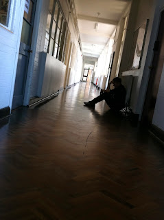
Canted Angle
Bird's Eye View
Low Angle
- Used Natural Light (in photo)
- Long shot (in photo)
- By using a low angle it can increase the height of the actor
- In low angle shots the background tends to be the sky or a ceiling
- Low angle shots are used to create fear among an audience as well as insecurity to the viewed
- Low angle shots can be used to show the dominance of a character.
High Angle
- Used Natural light (in photo)
- Long shot (in photo)
- High angle is where the camera is elevated above the actor or object
- High angle shots are used to make the actor seem less insignificant and weak
- Becomes 'swallowed up' by setting
Eye Level
- Natural Light (in photo)
- Extreme Close Up shot
- Used for a more neutral shot
- Positioned as though a person was viewing the scene
- Typically 5ft to 6ft above ground level

Canted Angle
- Natural Light/Backlight (in photo)
- Long shot (in photo)
- Canted angles are used to show imbalance as well as instability
- Used for suggested POV shots and hand held camera is typically used.
Bird's Eye View
- Natural Light (in photo)
- Show scene from directly above
- Gives viewer a 'godlike' position due to them being able to look down on everyone/thing.
- Can be used to make people look insignificant
Killer's Costume Ideas.
For our killer/stalker our group agreed on the audience remaining unknown to the characters ages, gender and anything else to really do with their appearance. I tried to create this by using dark clothing in these pictures to try and make the character's figure unisex so it keeps the audience thinking.
I used a black jumper, a black hat and a pair of dark blue jeans. I used these as they did not show any gender through the style of the clothing or the colour that I have chosen as a girl or a boy could wear these types of clothing. The black hat as well covers the character's hair so that the audience would not be able to see if they had long or short hair which may typically suggest to the audience of the character's gender.
I used a black jumper, a black hat and a pair of dark blue jeans. I used these as they did not show any gender through the style of the clothing or the colour that I have chosen as a girl or a boy could wear these types of clothing. The black hat as well covers the character's hair so that the audience would not be able to see if they had long or short hair which may typically suggest to the audience of the character's gender.
Evaluation.
The only thing that I could have changed is that the jumper I used had my dance school's logo on the front so if we were to use clothing like this we would have to use clothing with no logos or other images which could suggest a gender to the audience.Saturday, 23 November 2013
Filming: Re-shoot of Flashback scenes
Flashback scenes: Noose filming.
When I last did filming for the flashbacks of the noose for our film opening I filmed them in a portrait layout and so this would not be able to be used when editing all of the other clips together. So I did a re-shoot of these flashbacks but instead filmed them in a landscape way so they could be edited with the rest of the film opening.
I did exactly the same thing as I did for the last filming and edited them together so that they were faster and quicker changes so it looks like a flashback.
Thursday, 21 November 2013
- At the beginning of the animation, I used the font that Charlie selected: x
- The other font I used was 'Brain Flower'.
- I chose this font as it appears to be handwritten.
- I further manipulated the text on photoshop, by placing each letter on a different level.
- This added to the handwritten result, inspired by titles in the psychological horror film Orphan.
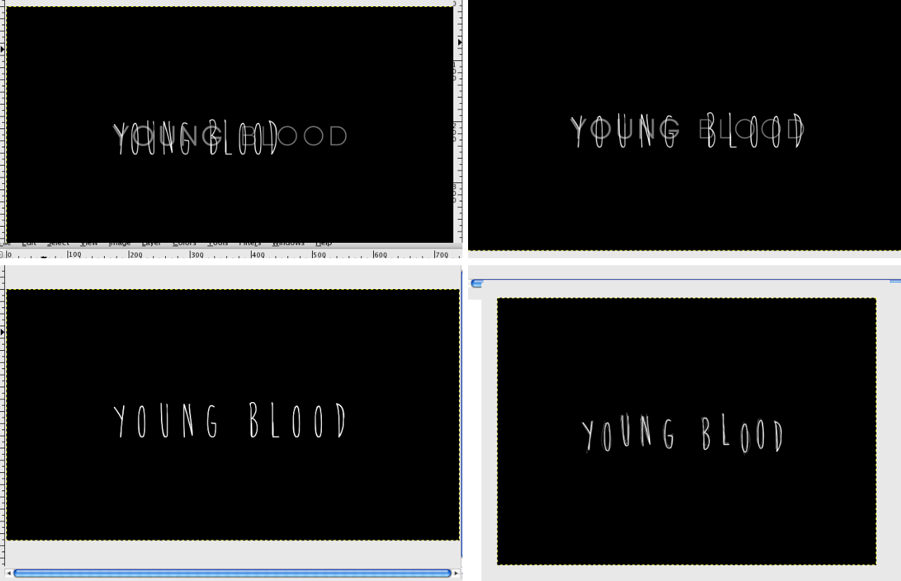
- I wanted the animation to flicker between the two fonts and have a broken TV effect.
- To create this effect, I used uncopyrighted grainy, noise textures.
- The animation flickers quickly between the two fonts with these textures in between.
- I also 'scribbled' around the Brain Flower font, to add to the handwritten effect.
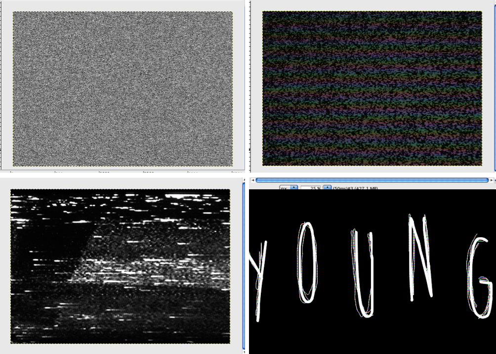
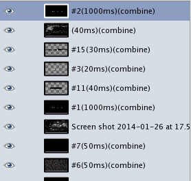
- The frames of the animation that contain the manipulated font and the VCR textures play for a much shorter amount of time than the font that Charlie created; the end result resembles the flashbacks that are included in our opening.
- Overall, I am happy with the result: the clean font at the beginning reflects upon the beauty that our killer strives for, whilst the manipulated font represents the horror underneath. Furthermore, I feel that the result fits within the psychological horror genre.
Subscribe to:
Comments (Atom)


