Monday 31 March 2014

First Draft Feedback

We showed the first draft of our opening to several other students, in order to gain their feedback.
They stated what they found to be effective, and also what they felt didn't work so well.
The parts that people felt were effective were:

  • The large range of shots
  • The non diegetic sound
  • Typography
  • Flashback shots are effective
The parts that people felt were less effective:
  • Horror genre unclear
  • Ending too abrupt
  • Title should appear at end
To improve, we moved the title ("Young Blood") to the end of the sequence.  We felt that this would also solve the problem of the ending being too abrupt and confusing.

Thursday 27 March 2014

Editing: Sound Alterations


  • When editing our film opening 'Locust Toybox - So 2005' was used as our introductory music.
  • When the music was applied to footage it became apparent that it didn't work.
  • After the thought that it didn't work I asked peers for their opinion.
  • They agreed as well as saying that the music sounded 'too medieval' for the sequence.
---
  • As an alternative to the non-diegetic soundtrack I thought that diegtic sounds of the environment would provide a better opening to set the scene rather that the non-diegetic music.
  • Seeing as the film opening starts on a bridge over a busy road, it made sense for traffic to be in place.
  • The diegetic sounds of traffic are more effective as it builds and fades into the non-diegetic soundtrack. 
  • This provides a build in tension with the start of a seemingly normal scene which progressively builds in tension and horror.
  • Below is the diegetic traffic sound effects that we decided on as a group.

Wednesday 26 March 2014

Editing: Reviewing and Refining


  • After finishing the basic outline of our film opening I went through the editing to check for continuity and improvements in which could be made.
  • When reviewing the editing I noticed a couple of clips which were out of place and lead to a lack of continuity.
  • The main problems which had to be corrected was with the bridge scene.
  • The first major continuity problem was that there was a shot of the killer walking towards the victim then after several shots including the victim walking and flashbacks the killer was back at the beginning of the bridge looking the victim.
  • To correct this I had to switch the clips around as well as a couple shots of the victim as their position on the bridge was also not flowing continuously.
The 2 shots which were in the incorrect order.
  • After continuity issue was that with the killer walking shot.
  • The clip was shown after the victim has already gone done the stairs which was an issue because the victim was in shot. (This can be seen in the shots below)
  • However this was corrected when I changed the continuity problem above.

  • When going through the film opening I noticed there were too much of the same flashback shot used which I felt was too repetitive.
  • Instead of filming for more flashback shots I used some old shots from my practical source of inspiration (https://www.youtube.com/watch?v=L5w2quV8bzU)
  •  I felt that this would be ideal as it is using the same location and would blend nicely in with the current footage.
  • By using this footage I was able to break the repetitive flashback shots used with a couple shots of the location and bloody hands. (shown above)
  • Another factor I looked for when reviewing the film opening was making sure that the most suitable clips have been selected.
  • When reviewing the footage I came across several inconsistencies where there equipment or people in shot when they shouldn't have.
  • In the example above, I saw that there was a tripod in frame which ruined the scene.
  • To correct this I selected the blade tool (example 1) and selected the point in which I will cut the clip (example 2) which was where the inconsistency stopped.
  • Finally (in example 3) after it had split into 2 clips I selected the first section and deleted it.

  • In previous blog posts I have looked into the 'letterbox' style.
  • This is where the video is cropped to a narrow aspect ratio.
  • As finishing touches to the film opening I applied letterbox to all of the clips on the timeline.
  • Before I used iMovie, in which I had to make it tailor made using a green screen effect.
  • However in Final Cut Pro, it is one of the effect options.

  • To apply the 'letterbox' effect to each clip I went into Video & Audio Effects and selected Letterbox which was under 'Stylise'.
  • From here I went into the inspector and changed the border size from 0 to 5.
  • I feel that by using letterbox framing it provides a more cinematic look and also brings out the colours within the footage more.
Before and After Letterbox Framing

Editing Colour and Sound

In this editing session I made more colour adjustments and correction as well as experimented with adding diegetic sound to the footage to make it appear and sound more realistic.

I began correcting colours in consecutive shots that did not have the same colouring, so the continuity of these shots would be fluid and therefore look more professional. The footage was dark and had a red cast to it, so I counteracted this by bringing out more blue midtones and shadows as well as increasing the saturation and exposure slightly so it would not look as dark as before.


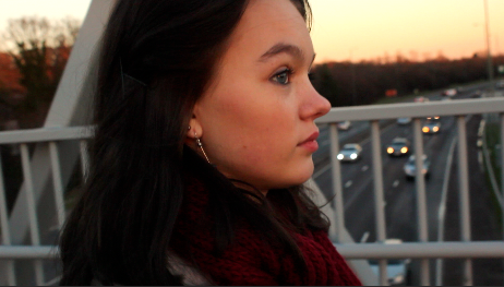
I continued this process on continuous shots that had a different shot cutting in between them. They were differently coloured despite being shot in the same location with the same miss-en-scene, so I adjusted the saturation levels of both shots and corrected the dark reddish cast present in the shots by focusing most of the colouring in the blues and greens on the colour board.

After correcting colours, I began working with sound. As it was my first time adding and adjusting external sounds on Final Cut Pro, I only used one sound.

I added the diegetic sound of a purse being dropped to the  corresponding shot, moving it so it would be directly parallel to the action instead of being disconnected and therefore making the footage look amateurish.


I then used the blade tool to cut the sound and make it shorter, as it was too long to correctly match the action in the shot. After this, the sound matched the footage but was too loud and some faint background noise was present, so I used the select tool to lower the volume of the individual sound to match the action but not overpower it.

Evaluation
I feel that this editing was successful, as I had more confidence and experience with the colour correcting, but I still did not do as much as I could have due to inexperience with editing sound. As the sound I edited was successful, I will work on more sounds in the future and improve further.


Tuesday 25 March 2014

Recording Sounds

Recording More Sounds.

When we continued to edit our final film opening we realised that we needed one more sound in order for the audience to know what was happening in the sequence.

We had to record the sound of a purse falling onto the ground and so we went to a quiet place and recorded this using an actual purse a few times in order to get the right sound effect.


Friday 21 March 2014

Soundtrack

  • When searching for uncopyrighted music, we found tracks created by David Firth, and felt that the tracks 'Mortician's Wife' and 'so 2005' would be effective in out opening.
  • I chose the track 'so 2005' as I was inspired by the use of contrapuntal sound in the opening sequence of the film 'The Woman in Black', in which the music has a positive tone, and contrasts with the sinister images seen in the sequence.

  • 'Mortician's Wife' is more effective for the second half of the sequence, as its ominous tone is more pronounced.  This is useful for our sequence, as we need the tension to build towards the end of the sequence, in which the killer approaches their victim.
  • However, I asked peers for feedback on this use of sound, and some stated that the slow pace of the music contrasted too heavily with the fast, jumpy pace at which the shots change.
  • Therefore, I feel that another upcopyrighted piece of music may need to be used.

'Glitch' Non-Diegetic Sound


  • As the flashbacks occur in our opening, non-diegetic 'glitch' sound effects can be heard, to emphasise the contrast between the happiness surrounding the victim, and the horror surrounding the killer.
  • These glitch sound effects were found on vimeo:


  • I also created glitch sound effects by warping recorded sounds, using garageband.
  • These sounds are parallel to the flashback shots that occur within the sequence.


  • Initially, the sound effects are quiet, but grow in volume as the sequence continues, to give the sequence a 'jumpy' mood.

  • Overall, I feel that these non-diegetic sounds are effective as they contrast with the calm mood in the beginning of the sequence and therefore create a sinister ambience.  Furthermore, the flashback shots are less confusing and out of place when paired with the sounds.

Wednesday 19 March 2014

Editing

  • In order to put our footage together in a way that will be comprehensible, I began with the shots on the bridge, in the street and in the alleyway (the shots of the killer's victim- Ellie).
  • The shots in the killer's garage will also be put together separately, to ensure that the storyline is clear before both settings are put together.
  • I have also used the flashback footage between some shots, in order to introduce the horror genre to the audience early on.
  • Each of the flashback shots are cut down to less than a second each, and they cut back to the same shot (for example, the close up shot of Ellie, seen below) as before.
  • I considered using a cross blur transition effect between the flashback shots and the 'present day' shots, however, I felt that simple straight cut edits were more effective, as they have a jumpy, jolting effect: a jumpy tone is a key feature of most horror genres.
  • I also considered using a cross blur transition effect between the footage and the credits, but I felt that continuing with straight cuts would help the sequence have a consistent style throughout.

  • The area I have been having the most difficulty with, is editing the colours in the shots.
  • As the shots are largely set outdoors, making sure the lighting and colours are consistent throughout all the shots has become a hindrance.
  • For example, some shots have brighter, more orange sunsets than others.
  • I used the colour, saturation and exposure tools to edit the colours of the shots.

  • For example, here, I had to make the tracking shot of Ellie more saturated and have a more orange tone in order to match the colours in the other shots on the bridge.


  • Similarly, I had to make some shots darker, in order to show the transition from day to night:


Here are 44 seconds of edited footage:


Sunday 16 March 2014

Editing Footage

I started editing some of the footage the group has compiled as we have finished filming most of our opening and need to start the editing process. As it was my first time editing and using Final Cut Pro software, I only made minor changes such as colour correction and cutting unneeded footage.


To begin with I experimented with some of the special effects the software offered, but did not include any in the end as I felt they made the footage look more amateurish than before.


Next I experimented with saturation and exposure levels. As the footage is going to be used in a scene set at twilight/dusk, it needed to be made slightly darker and more shadowy, as it had been shot at an earlier time to ensure it was visible. To achieve this, I decreased the brightness of the footage slightly and brought the shadows that were already present forward.


Then I changed the colour filters on the footage to make it look a little darker and colder. To do this I increased the darker blue and purple tones in the footage and experimented with the more yellow tones in the religious mural to complement the yellow colour already present.


After making colour and lighting corrections I used the blade tool to cut unneeded footage, as the total footage we had was over 8 minutes long. I reviewed the footage and decided which shots were the most effective and looked the best after the corrections and kept those shots, cutting nearly 5 minutes of unneeded footage. 


Evaluation
I feel that while this editing session was successful, I didn't so as much as I could have if I had more experience using editing software. To improve next time, I will edit more footage to gain more experience with the software and improve the quality of the project.

Saturday 8 March 2014

Recording of Sounds

For our film opening we would be needing some diegetic sounds to overlay on top of our non-diegetic sound we will have throughout the film opening.

First of all we decided to record basic footsteps to use in the film opening. We waited until our surroundings were quiet and then had one of us walk down a corridor whilst the other recorded the sounds that were made. We ended up with having two sets of recordings for the footsteps as one sounded better than the other in some ways, it was louder and seemed to be more realistic.


The next diegetic sound we recorded was that of a door opening. We found a fairly old door that would make a lot of noise that we could capture when we were to open it. The noise it made was very realistic when we listened back to the recording.


The final sound we recorded was of the same door closing. We used the same door so that it would sound similar to when it was being opened but instead in reverse to portray that fact that the door would be closing instead of opening like in the previous sound clip.


Evaluation.

  • Overall I believe the sounds were quite well recorded and sounded like we wanted them to.
  • There may be some fuzzy sounds that can be heard in the background from the recorder so we may need to consider re-recording again
  • The sounds we recorded were what we needed for our film opening.

Tuesday 4 March 2014

Evaulation of Garage Shoot


  • Here are 3 sections from a clip I filmed in which I used a macro lens.
  • By using the macro lens I was able to have close up shots of the jars of high quality.
  • In these shots I tried with experimenting with the use of light and using different motions.
  • In the first shot, I shook the torch a little to give the handheld effect.
  • In the second shot, I used a smooth and steady motion upwards.
  • This was to give the illusion the killer was scanning the dark lair looking for something.
  • In the final section I went in to grab the jar. I did this as I feel this shot would make the audience aware that the killer is present in the scene and just off-screen/his perspective.
  • Overall this was one of the better shots from my macro shots of the jars as it highly effective in projecting a dark and bloody atmosphere.


  • In this shot I looked more into the contents of the jar.
  • By using a macro lens I have 


Thursday 27 February 2014

Shooting Script: Garage

Date:

Sunday 2nd March

Place:

  • Garage at Charlotte's house

People :

  • Charlotte

Equipment needed for shoot:
  • Torches (white light/warm white light)
  • Tripod
  • Macro Lens
  • Camera
Props Required:
  • Killer's Jars

Aim of Shoot:
  • Film the Killer's Jars in which there are 'body parts' and blood.
  • Wide range of shots (angles and movement)


Sunday 23 February 2014

Mise-en-Scene: Jars

As my last attempt at making the killer's jars was unsuccessful, I tried again with different materials to make the jar look more realistic and effective.


  • I used warm water and brown/yellow coloured materials such as gravy granules, honey and tea to make the liquid inside the jar look old and decayed, to show the killer has kept these jars as souvenirs for a long time. The liquid is also not as opaque as my previous attempt, so the solids in the jar can still be seen.
  • For the 'body parts', I used dried orange peel and orange segments as I felt they resembled human insides or decayed human flesh.


Overall this attempt was more successful than the previous jar I created, as it looks somewhat more realistic. However I am still not happy with this jar as the liquid was not hot enough to mix all the ingredients together, so some of them stayed solid and stuck to the bottom and sides of the jar, and therefore took away from the effect.

Thursday 6 February 2014

Finalising Credits


  • Previously I looked into the typography to use in our film opening title and credits. 
  • I have refined it down to using the font 'Biko' which is very clean cut and modern and can be moulded to fit most film genres.
  • The original idea for the credits were:

  • However I didn't test it out on more than one name which lead to issues of the layout and the overall appearance.
  • After taking the factors that went wrong into consideration I redesigned the layout and positioning of the credits.
  • Here is the basic structure in which I created using multiple names. 


  • I am overall really pleased with the outcome of the new design for the typography credits, they have come out more professional and I particularly like the use of spacing and contrasting font weights.
  • However I felt that it would be nice if the credit typography was manipulated to have a slight disfigurement to make a subtle reference to the killer's underlying psychological problems.
  • After experimenting with different effects I used this one:


  • Here I used an effect called 'Scrape' which distorts and elongates words. I have used it to create this slight disfigurement in the template for the credits.
  • I quite like the simple and subtle quirk to the credit and provides that slight disfigurement I had hoped for.

settings I used to create the slight manipulation

  • After this I wanted to add a slight bit of movement to the credits as they were looking rather dull.
  • After a series of trials I thought the most effective effect was 'Projector' with an overlay of 'Shadows'
  • The 'Projector' effect alters the credits to make them shake a little as well as add slight noise to the black background as well as add a slight glow to the text.
  • Then the use of the 'Shadow' effect to slightly dull the white text which was needed after the 'Projector' effect increased the white in the text which was just to much/
  • Overall the outcome of the credits, I feel, have been well executed and are finished enough to the point of them being ready to use straight away for the opening credits of our film opening.
  • The slight shakiness, I feel adds to the effectiveness of our film genre, Psychological Horror.
  • I think that these credits will work really well in the film opening and enhance the quality, making our film opening appear more professional
  • In the clip above shows the order in which the credits appear as well as the length the credits will stay on screen for which is 3 seconds (at the moment).
  • In between these credits will be the edited footage of our film.


Wednesday 5 February 2014

Production Company

  • To decide which production company is the best to use, we looked at several production companies and the horror films they produced.
  • Dark Castle Entertainment has produced several horror films:
  • Ghost ship [2002]- Supernatural, Thir13en Ghosts [2001]- Supernatural, House on Haunted Hill [1999]- Supernatural
  • But only one psychological horror:
  • Orphan [2009]


  • Twisted Pictures is similar in that it has produced several horror films:
  • Saw [2004-2010]- slasher, Dead Silence [2007]- supernatural,
  • but has not produced many psychological horrors.

  • Platinum Dunes has produced Texas Chainsaw Massacre [2003]- slasher, The Purge [2013]- science fiction & The Unborn [2009]- supernatural
  • But no psychological horrors.

  • We decided that Paramount Pictures is the best option for us as they have produced horror films from a range of genres, including psychological horror films:
  • Shutter Island [2010], Zodiac [2007]


  • As we chose the psychological horror genre for our opening sequence, we felt that a production company that has produced several psychological horror films already (Paramount Pictures) would be the best option.
  • Their logo, however, does not appear to fit the psychological horror genre:


  • I edited this image, to ensure that the audience realises that the film is within the horror genre, from the very beginning of the sequence.


  • Firstly, using photoshop, I made the image darker, and less saturated.
  • I also added a grainy texture.


  • I created several glitch effects, so that the overall animation would have a distorted, sinister tone.


  • Overall, I feel that the result is effective, as it is more clearly from a horror film than the original logo was.
  • One improvement that needs to be made, is that the production company itself isn't clear to the audience as it does not stay on the screen for enough time.  To solve this problem, the edited logo should appear again after the glitch has occurred, to become more readable for the audience.

Opening Credits


  • We wanted the design for our film title to carry across to our opening credits, so I applied the same glitch effect, using Photoshop, to the fonts that Charlotte had chosen.
  • Here are two examples:


  • Overall, I feel that this will be effective for our opening, as it uses the same glitch effect that the title does, and therefore, one theme is carried across the entire sequence.

Killer's Jars

To establish the mental instability and obsessive nature of our serial killer, we decided that she would keep body parts of her victims in jars, which we would include in the mise-en-scene of her lair. To prepare for the scene of the lair, I attempted to make these kinds of jars with household items.

  • I used tap water mixed with green and yellow paint to create the liquid inside the jars
  • I tried to use pieces of fruit as body parts, but these would float to the top of the liquid and could not be seen from the side. They also did not look realistic, and so were ineffective.
  • I then moulded red and yellow plasticine into finger and toe shapes, and painted them grey and green to make them look decayed.


My first attempt was not successful, as the liquid looked too bright and was too opaque, so the plasticine models could not be seen.


My second attempt was slightly more successful, but was still ineffective as the liquid was still too opaque and the paint on the plasticine came off in the liquid, so the bright colours could be seen and so made the models look unrealistic.

To improve next time, I will experiment with different materials and ensure the ones I use look as effective and realistic as possible.

Production Company

We have decided that the major company production we will use in our film opening is Paramount Pictures.

We made this decision because out of the previous research we conducted on major production companies, Paramount had released more psychological horrors than the other companies researched and so would be more suitable for us to use.

Garage Scene: Mise-en-Scene Log

In this scene, we are shooting our antagonist in their garage lair surrounded by items that establish to the audience that they are a serial killer and are conventional to the psychological horror genre. The mise-en-scene needed in this scene will be:

  • The killer's journal
  • Photos of past victims on the garage wall
  • A desk
  • Tools and weapons e.g. craft knives
  • Jars full of body parts and liquids
In terms of costume, the killer's identity will remain hidden from the audience, so they will wear dark/black jeans and a black hooded top with the hood up over the actor's face. This scene will be shot in low key lighting with a desk lamp and a torch to create an unsettling and anticipative atmosphere for the audience. 

Killer and Victim Costumes (Our Own)

Victim's Costume.
 

We decided that our victim would be wearing modern style clothing so that our target audience would be able to connect with the character and also since the genre of psychological horror, which is what our film opening is labelled as, is a fairly new genre it also conforms to the conventions of a psychological horror film.
 
Our victim would be wearing a fairly long coat, dark jeans/trousers and low ankle boots. It is a simple costume but also ties into our film opening by being modern and also for the actor to be wearing this type of clothing as our killer is obsessed with youth and beauty so it would make sense for us to use modern style clothing instead of an older look.


Killer's Costume.
 
 
For our killer we decided that we didn't want their identity to be known to the audience so that it would keep a sense of mystery behind the character and what is going on in their mind. In this case we decided that dark clothing that wouldn't be identified with either a male or female actor would be the best for our killer.
 
We opted for a black hoody/coat, black jeans and dark plimsoll shoes as all of these items could be associated with either male or female. The hoody/coat that we used was also quite big as then the character's figure couldn't be identified by the audience of a specific gender so our killer would still be in a sense of mystery.  


Sunday 26 January 2014

Sound Deconstruction: Se7en

The sound I will be deconstructing is the non diegetic music from the opening sequence of 'Se7en'.


  • The sound is parallel to the unsettling images shown onscreen, reinforcing the psychological horror genre.
  • There is a high pitched, fast paced beat in the background that is present throughout the entire sound and is one of the most regular elements of the sound.
  • Throughout the sequence, a distorted squealing sound can be heard that is grating and will shock the audience listening.
  • Static can also be heard at various points during the sequence, which makes the music sound more disjointed and unsettling.
  • Before the music noticeably intensifies at 1:13, echoing synth notes can be heard. These sound like high pitched vocalising, which juxtaposes with the other harsh distorted noises present and creates a jarring effect.
  • At 1:13, electric guitar riffs are added to the music, which then intensifies as the sounds get louder and faster.
  • More electric guitar riffs can be heard towards the end of the sequence, which build in volume in a crescendo and give the music a frantic, disjointed feel.
This deconstruction is useful as we can use this as a reference when we create our final soundtrack for our film opening. This sequence uses shocking, distorted sounds to shock and unsettle the audience, which we can incorporate into our own soundtrack to make it more successful.

Opening Titles: American Horror Story


 0:09 Actor
Zachary Quinto
0:16 Actor: Joseph Fiennes
0:24 Actor
Sarah Paulson
0:33 Actor
Evan peters

Continued: